A UX Researcher, Writer and Consultant.
Improving Navigation of a Sales Acceleration platform
Methods
Heatmaps, Surveys, Remote Card Sorting, Remote First Click Testing, A/B Testing
Tools
Miro, Churnzero,
Mixpanel, Fullstory,
Dovetail
Timeline
5 weeks
Identify
Propose
Conduct
Analyze
Report
Track
Background
Auctm's B2B offering provides a dashboard to manage and monitor the Sales performance of the real estate agents in a team.

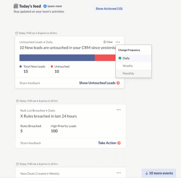
Heatmap Analysis & Statistics
As a result of the quarterly heatmap analysis I did for the Auctm web-app, I discovered that 70% of users do not scroll below the fold to the essential areas of the webapp.
81% users only visited the first page<20% engagement rate on key features
Survey
Key Findings
I sent out a survey targeted to all users through Churnzero as a popup for users visiting the web application, focusing on:
What did they come to find on the website?
If users are able to find what they came for?
Did they know they could do x task through Auctm?
35% users could not find what they were looking for
Apart from two tasks, rest of the features were discovered by <25% users
Problem Statement
How might we improve the navigation of the Auctm Web-app so that users don't miss out on important features?
Card Sorting

I did a card sorting exercise with 26 users.
Recruitment criteria:
-
10 power users
-
16 new users(onboarded but not frequently using the product)
To understand where the users would expect to find certain information on the product, I did a card sorting exercise.
With each card that the user sorted, I asked why they chose to associate the data point with the term. This gave us a fair idea of how users cluster information.
Based on the card sorting exercise, we made a first prototype of the navigation menu, on which we did a first click testing to test what paths would user take in different scenarios
First Click Usability Test / AB Testing
Results from Card sorting exercise gave me insight into user's point of view without reference to the product or a scenario, hence I conducted a scenario-based first click testing exercise on two prototypes to understand how users will perceive information if they were to perform a task and the product was to be used in that scenario.

Data Analysis

Methods used to analyze the data gathered from the user sessions:
-
Using Spreadsheets - mapping frequency and percentages
-
Collaborated with Product Managers and Designers to map the tasks to the menu information
Research Insights & Final Prototype
The analysis showed how the information users segregated was separated by different facets of the industry and then how they would analyse to improve or monitor that facet.
The study indicated that users needed words in the menu that spoke to them of what they would be able to do from the particular page.
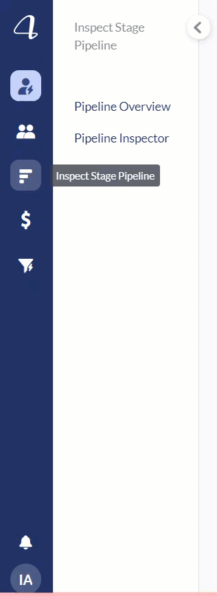
New Navigation
Outcome/Impact
93%
Increased engagement on the individual modules of the web app in the following quarter.